
The Great Housing Decoupling
Where “What We Build” and “What We Pay” No Longer Match
Montreal rent is almost completely decoupled from the kind of buildings being rented.
Housing theorists have long talked about how rent doesn’t always reflect the real value of the apartment being rented. The most run-down 100 year old apartment could rent for $1,500. But we all know that the apartment itself is not worth the three decades of primer it’s been slathered in.
But now there’s some more data to back just how separate rent is from the apartment itself. Below I breakdown the results of my recent analysis as well as what it means for Montréal’s housing policy.
1.Mapping Montréal’s Housing
To analyze this, I used a spatial clustering algorithm to analyze Montreal’s rental market in two ways.
First, I fed it data on Montréal’s 500+ census tracts, and asked it to group tracts based only on their physical housing characteristic, including building age, height, and how many people rented there, etc. The results grouped the city into six unique housing zones.
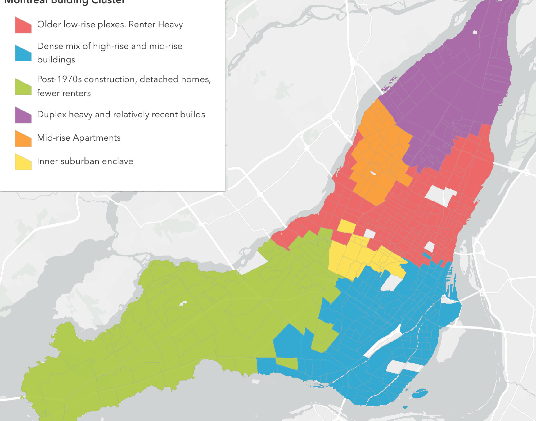
- Red Zones: Older low-rise plexes like Plateau, Rosemont, Villeray, Hochelaga. Mostly renters.
- Green Zones: Post-1970s construction, detached homes, very few renters
- Blue Zones: A dense mix of high-rise and mid-rise buildings.
- Purple Zones: Duplex heavy and relatively recent builds.
- Yellow Zones: A small inner-suburb enclave
- Orange Zones: A small outlier, not quite suburban, with apartments built in 1960s and 1970s.
What’s striking is how intuitive the result looks, even without telling the model anything about the neighborhoods except their housing stock.
2. Clustering Rental Price
Next, I ran the same algorithm again, but this time I asked it to cluster the census tracts based only on average rent.
If rental costs were determined by the type of housing supply and renter density in a neighborhood, then everyone inside the “Red Zone” would pay roughly the same rent. After all, red zones all share the same housing stock features and have a similar neighborhood makeup. Map A and Map B should look the same.
But they don’t look alike at all.
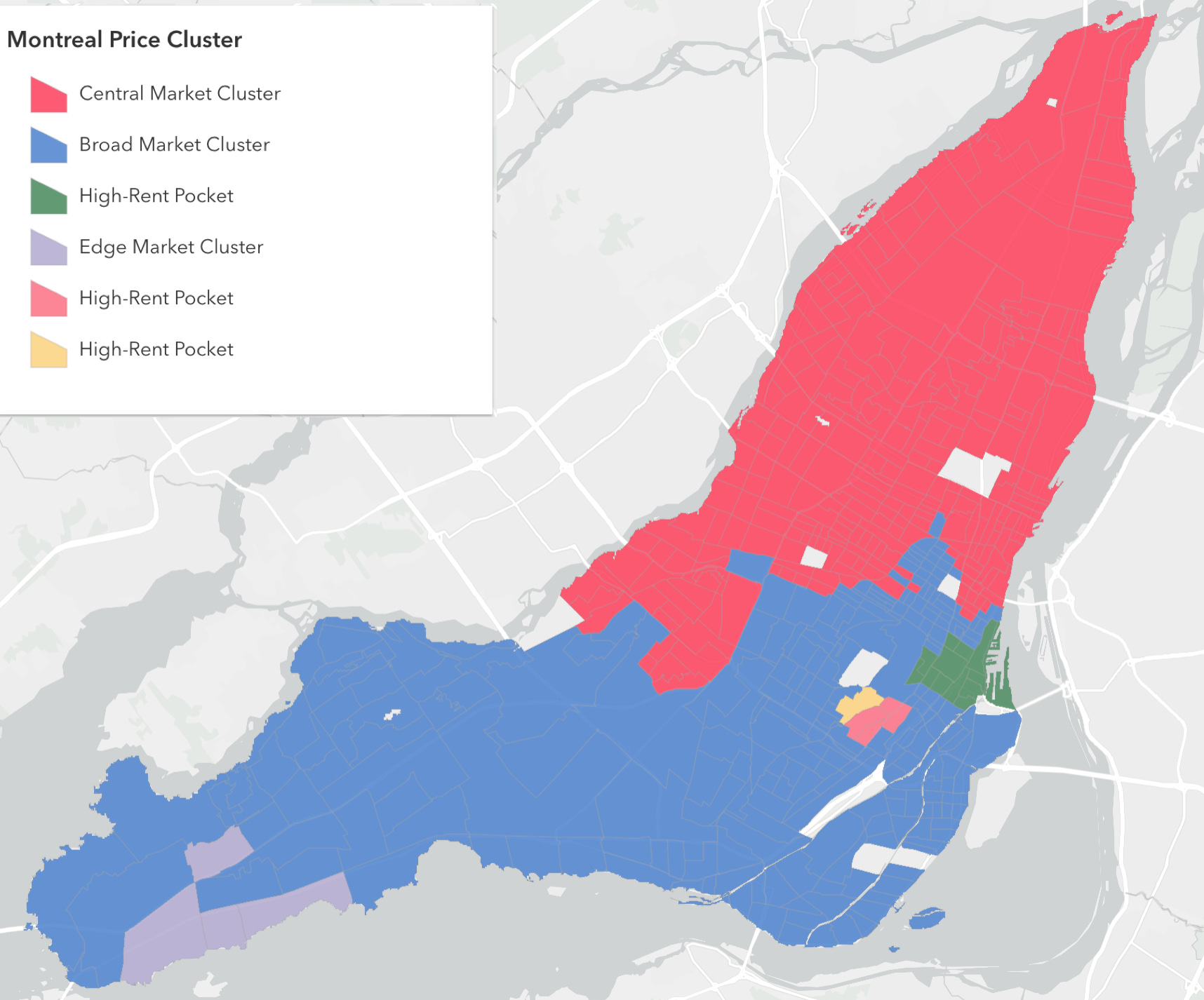
The second map shows a significant divergence of rental price from the physical housing stock.
Mathematically, the spatial correspondence between “housing type” and “price” is weak, scoring just 0.26 on the Adjusted Rand Index, where 1.0 means perfect match and 0.0 means random.
While Montreal’s physical housing landscape is highly distinct, forming six clear zones of typology and tenure, the rental market is far blunter. The SKATER algorithm identifies two massive pricing super-regions: a Central/ Eastern Zone in red that lumps the trendy Plateau with the working-class East End, and a Western/ Southern Periphery Zone (Blue) that groups the suburban West Island with the dense rentals of Verdun. This suggests that the market overrides physical neighborhood differences, applying standardized price floors across vast swaths of the city, punctuated only by small luxury enclaves in Westmount, Downtown, and near McGill University.
In short, the map of ‘what we build’ and the map of ‘what we pay’ barely overlap. They are decoupled. Identical buildings cost wildly different amounts depending on where they are in the city.
In short, the map of what we build and the map of what we pay barely overlap. They are decoupled. Identical buildings cost wildly different amounts depending on where they are in the city.
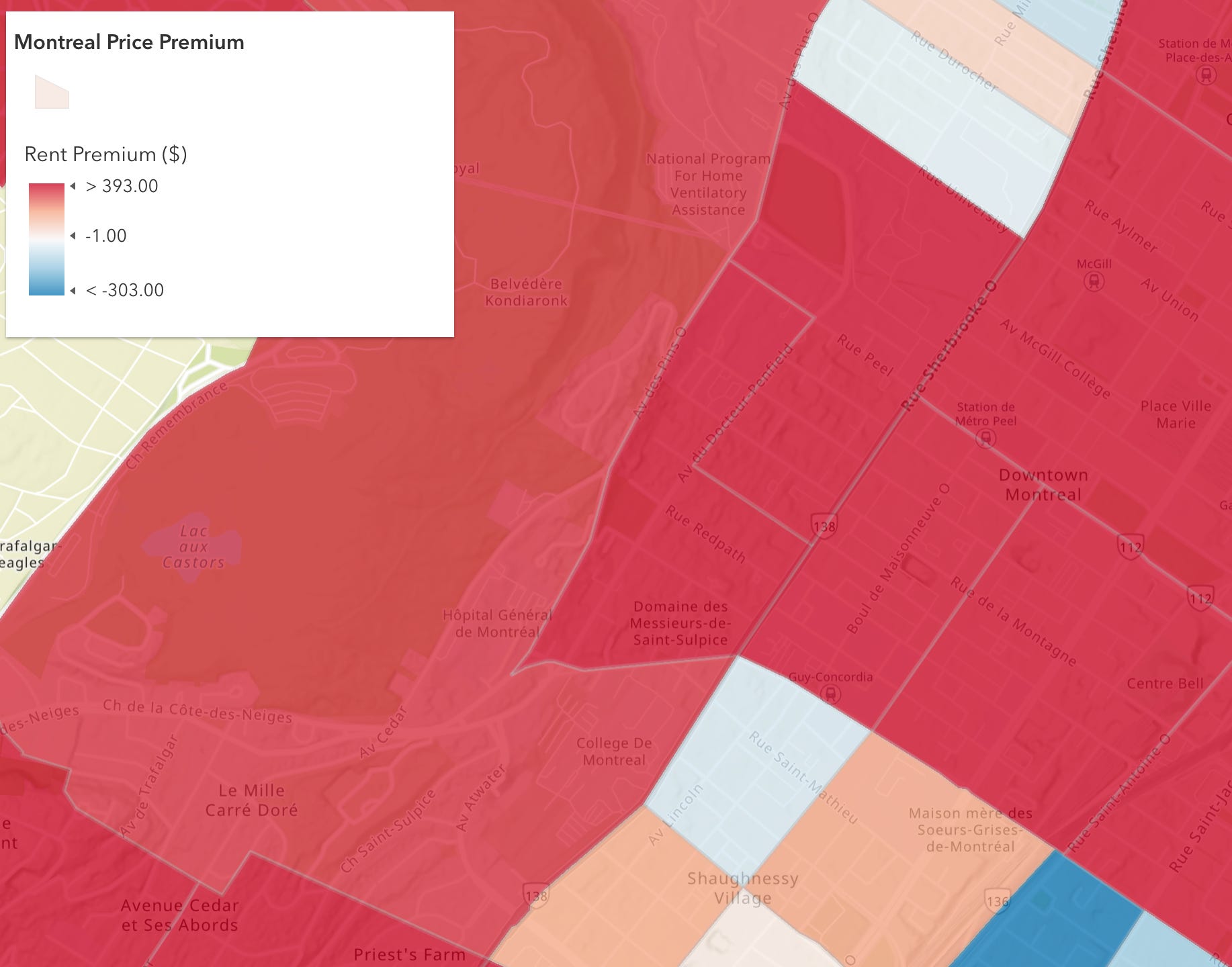
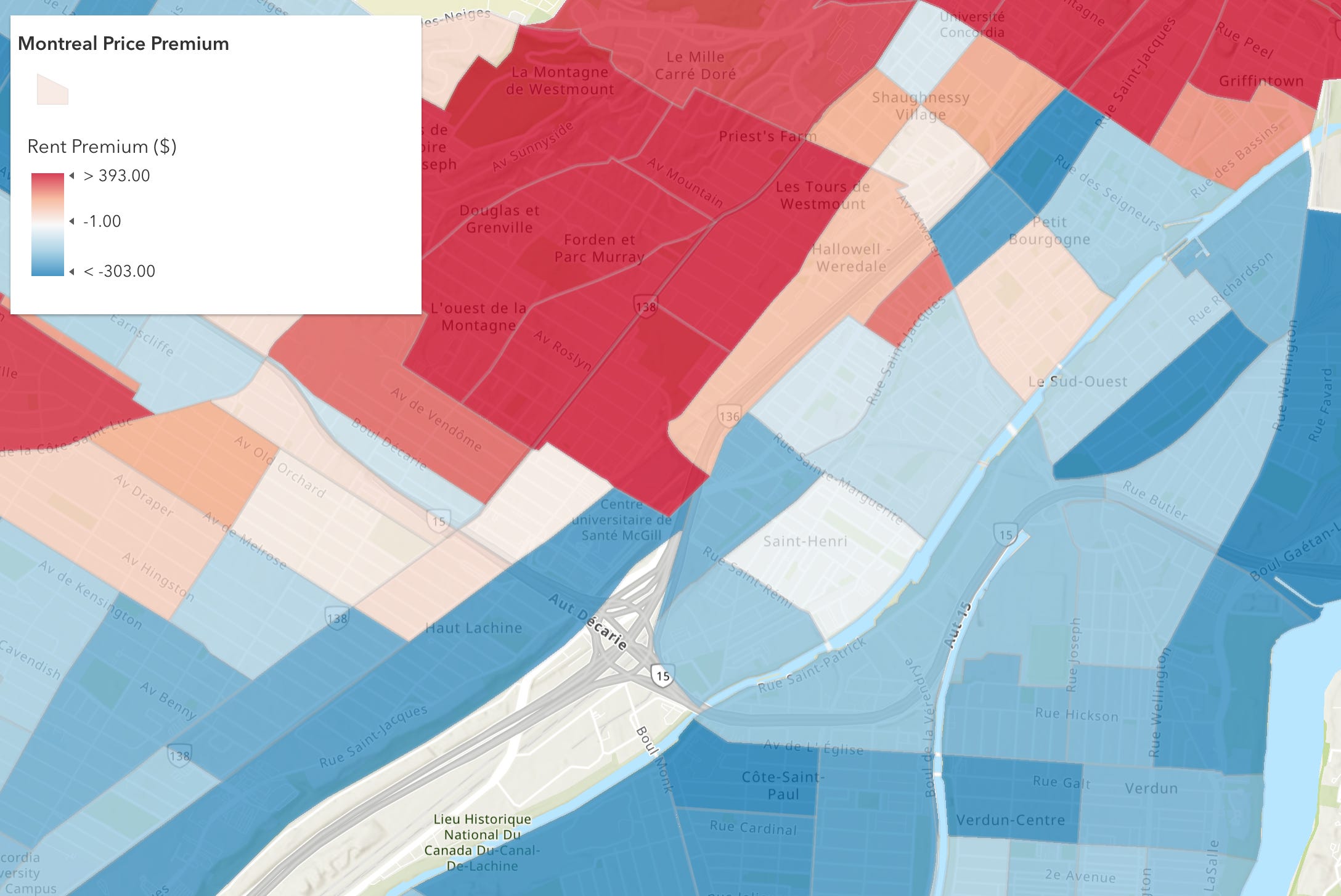
3. Rent Premiums
With this data, I mapped out a rent premium for each tract, where the rent deviates from what you’d expect to pay based on the kind of buildings there.
This map shows where rents are higher, lower, or on par for the housing stock and renter density in that census tract.
· Red is a higher premium. Rents are higher than expected for that housing type.
· Blue is a negative premium. Rents there are lower than you’d expect for that kind of housing stock
· White is roughly what you’d expect for the kind of housing stock.
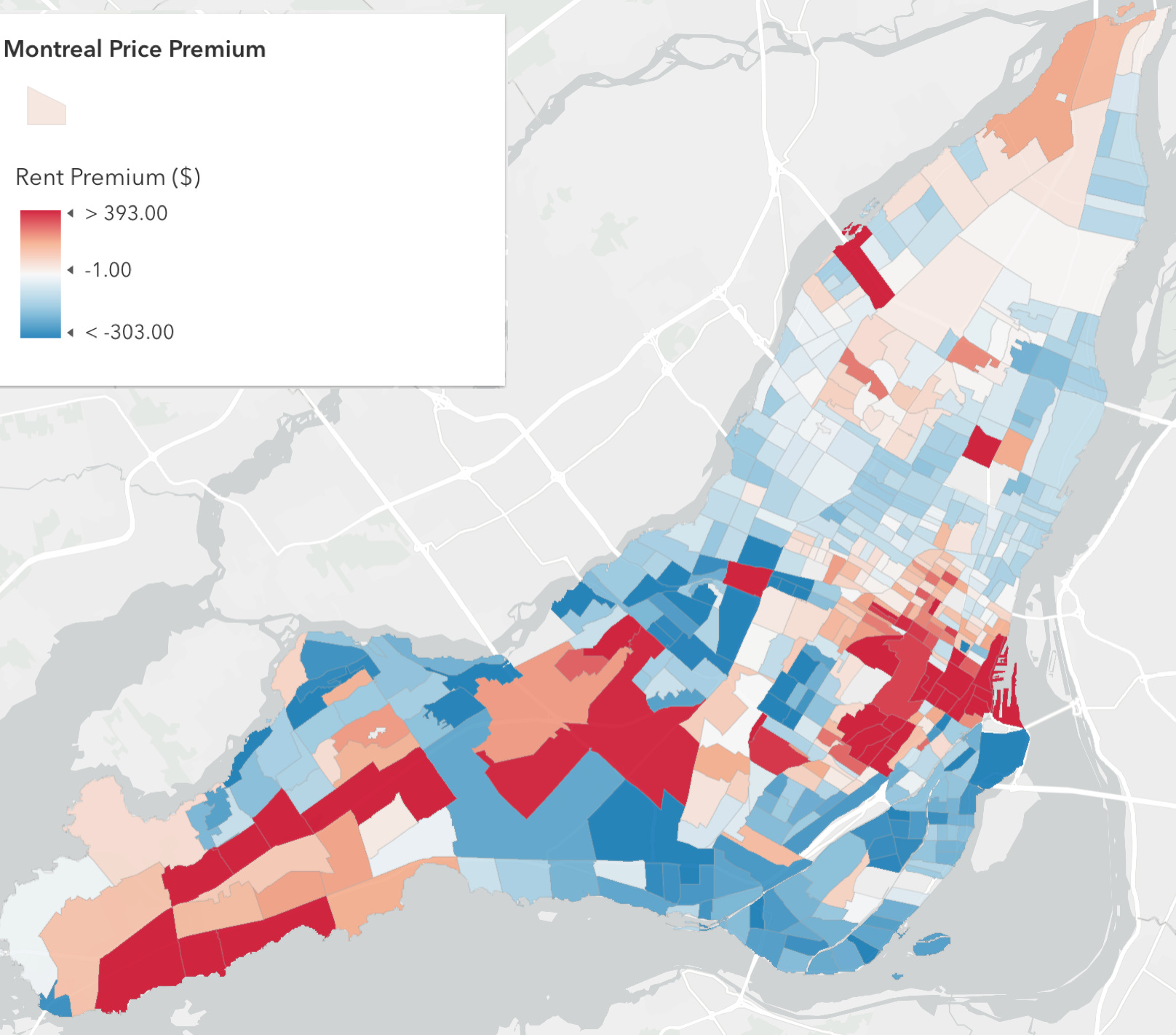
There are a couple places on the island that help visualize this story.
The Plateau
Deep red across Plateau and Mile-End. These areas rent for hundreds more per month than you’d expect given that the underlying housing stock looks similar to other pre-1940, low-rise rental neighborhoods, like Hochelaga. That gap is partly location value, proximity to downtown, amenities, reputation, demand. And an endless supply of private importation buvettes.
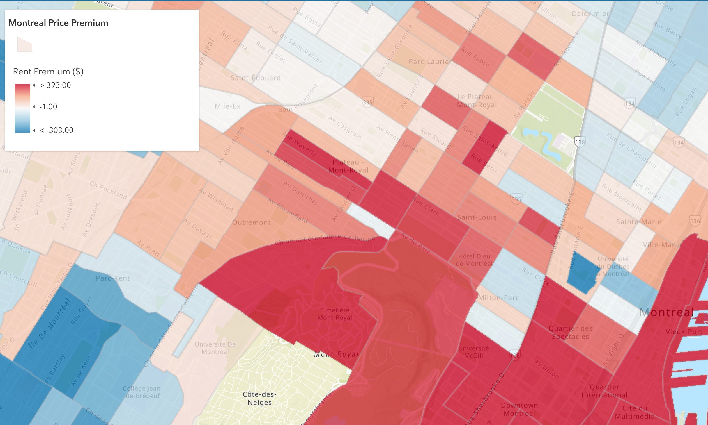
McGill
The Milton-Parc and McGill Ghetto area appears to show some of the deepest red premiums on the island. This is some of the oldest, most poorly maintained housing stock in the city (I know from first-hand experience), yet rents are extremely high in part because of university proximity. The premium here seems to be the clearest example of the market extracting maximum value from minimal physical quality. You’re paying for the 5-minute walk to campus, not the apartment itself.
Verdun & La Salle
Across the canal and into Verdun and Sud Ouest, the premium map stays mostly blue and neutral. This means rents are at or below what the housing type predicts. But then, right at the edge of the core, a tight pocket around Petite Bourgogne flips red. Interestingly, premiums don’t always behave like a smooth gradient or a neighborhood-wide story. They show up as localized spikes where a handful of census tracts detach from the expected price for that same building type.
4. So What?
Supply matters for rent, but place-value matters too. When it comes to lowering rents, new units built in high-premium areas may not translate into broad affordability if the location premium stays strong.
If you build 1,000 units in a deep red zone, does the premium drop to $200? Does it drop at all? Or do those units just absorb the existing premium because demand for that specific location is relatively inelastic. Meaning, people will pay to be there regardless.
What this map begins to hint at is that the rent premium is structural, not just a supply-demand mismatch. The Plateau premium exists even in census tracts with older, lower-quality housing. Hochelaga has similar buildings and renter density, but no premium. The difference isn’t supply alone, but partly location value.
One theory is that if most new construction concentrates in high-premium areas (because that’s where developers can profit), you’re building where it’s hardest to move the affordability needle. You’d need massive oversupply to erode a location premium, and the market won’t deliver that on its own. Meanwhile, building in blue zones (low-premium areas) would more directly increase affordable options, but developers won’t go there because the returns are lower.
You’d need massive oversupply to erode a location premium, and the market won’t deliver that on its own.
To be sure, supply helps, but you can’t build your way out of a $400 location premium without either (a) flooding desirable areas with so much supply that location value collapses, or (b) policies that directly address the premium like rent control in high-premium zones, inclusionary zoning requirements, or incentivizing construction in low-premium areas.